· 5 min read
Who the button hides
A button that promises dinner or a ride compresses another person's time and judgment into a single clickable verb.

Last month I pressed a button that said Deliver, and forty minutes later a stranger stood in the rain outside my door holding soup. Every spec I've read has plenty to say about the button. None of them mention him.
The HTML Standard defines the element, its types, its activation behavior, and the commands it can send. The WAI-ARIA button pattern says a button lets a user trigger an action or event, then covers label, focus, keyboard interaction, and state. All of it is correct, and all of it stops before the part I keep getting stuck on.
Trigger an action has no worker in it. A click dispatches an event in a few milliseconds, but the buttons in products promise dinner, a ride across town, a moderation decision, a refund. Code routes those requests; it can't cook, or carry a bag up four flights of stairs, or decide whether an appeal deserves a second look. And when the transaction gets smooth enough, the person doing the work starts to feel like network delay.
The verb eats the worker#
Button labels are tiny imperatives: Order, Send, Generate, Report. The grammar centers your intention and drops the subject who has to fulfill it. You press Deliver, the system says confirmed, and somewhere between those two words a cook, a courier, a dispatcher, and whoever answers the phone when the order goes wrong have all done their part without appearing in the sentence.
Interface
“Deliver dinner” — one tap
System
dispatch · route · time · rate
People
cook · courier · support agent
A button is a promise made in someone else's name. Asking who the button is means asking whose availability and whose patience got packaged into a dependable action — maybe someone working right now, maybe someone waiting for the next task to appear, maybe someone whose labeling work years ago trained the system that seems to answer on its own.
None of this makes every button an ethical crisis. Close dialog can stay a local state change. The question only matters when the label crosses out of software into another person's time — and the screen gives you no hint which kind you're pressing, since it's the same rounded rectangle either way.
The human API#
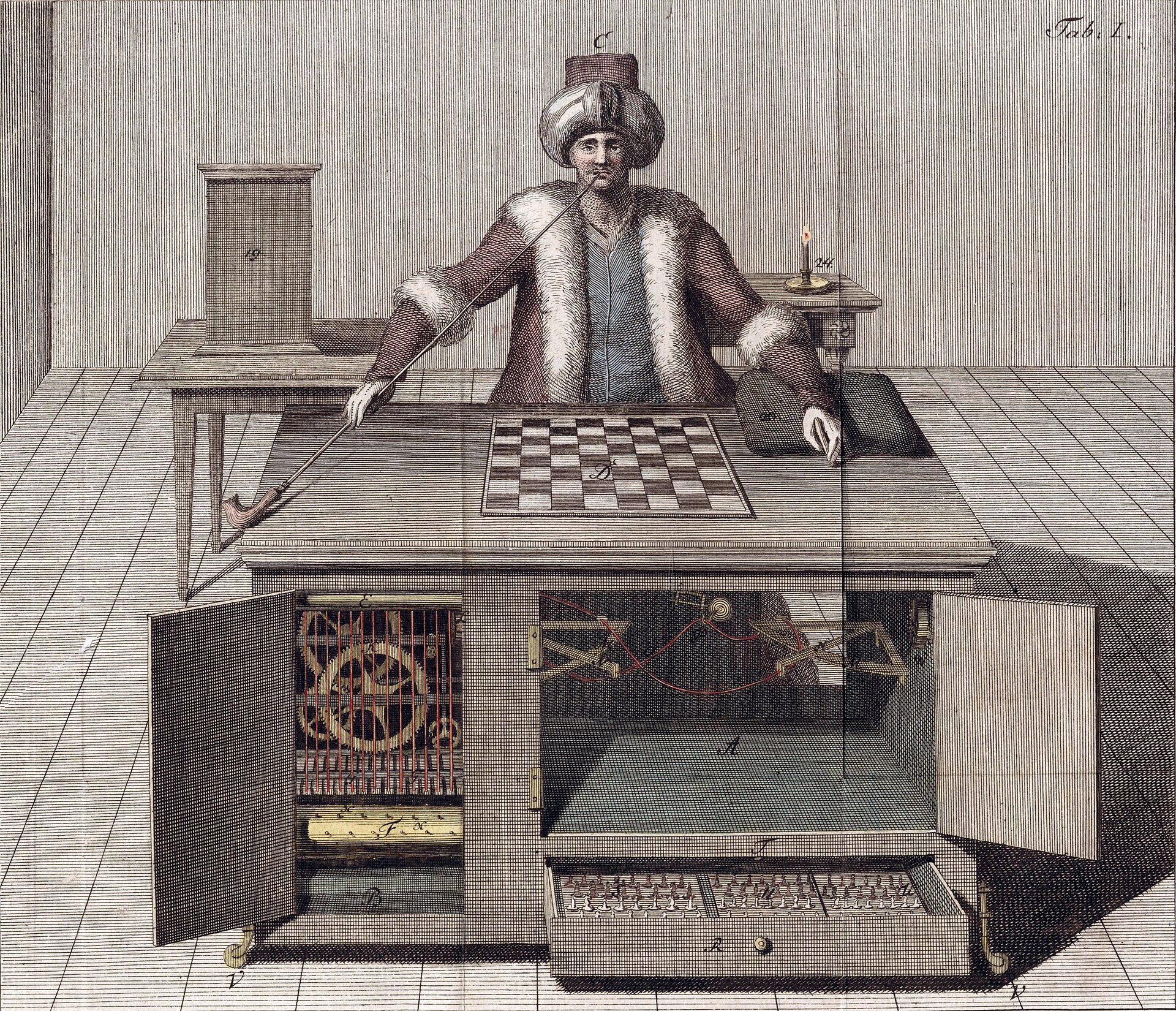
The original Mechanical Turk was a chess-playing machine with a person folded inside the cabinet. Edgar Allan Poe's 1836 essay “Maelzel's Chess-Player” works backward from how the machine behaves to argue that there has to be someone in there. The modern service that borrowed the name turns the same trick into an integration pattern.
Amazon describes Mechanical Turk as access to a distributed workforce through a user interface or API. Businesses split work into microtasks, send them out to people, and fold the returned answers straight back into their software — content moderation, research, data validation, machine-learning annotation, the page lists them all. Seen from the calling application, a person looks remarkably like a function.
The numbers underneath are worth sitting with. A study of 2,676 Mechanical Turk workers completing 3.8 million tasks estimated a median hourly wage of roughly $2, with 4 percent of workers earning more than the United States federal minimum wage. That figure includes the work the interface never counts — hunting for tasks, redoing rejected work, starting tasks that never get submitted. None of that time shows up in the API response.
The platform economy runs the same pattern through streets and warehouses. The International Labour Organization's global report draws on interviews and surveys with about 12,000 workers and 85 businesses to look at how platforms reorganize work. A customer sees a button that says Get a ride; a driver sees a timed offer and a button that says Accept. The coordination is still done by people — the platform's contribution is the queue between them, and a different rectangle on each side.
Name the other side#
Good interface work already insists that a button expose its role and carry an accessible name. When a person is on the other end, we owe a second kind of legibility. Nothing elaborate — no organization chart under every control — but enough context that the interface stops presenting someone as an instantaneous subroutine.
- Say whether the result is automated, human-reviewed, or human-performed.
- Show the wait as a person's availability, not an unexplained spinner.
- Explain what cancellation, retries, ratings, and appeals do to the other side.
- Let the worker refuse or contest the command that reaches them.
Details like these change how people behave. A customer who sees their report land in a moderation queue understands why nothing happens for an hour. A rider who sees the driver's route before canceling understands that someone is already in motion. As far as I can tell, none of it ruins the service.
I still press the buttons. The soup arrived, and it was good. But now I notice the pause after Report and wonder whether it means a queue or a person, and whether whoever reads it gets to say no. The spec can't tell me that. The rectangle, at least, is well documented.