· 3 min read
The AI sheen
AI-generated images remain hard to accept because their default polish has become a visible shorthand for cheap, unconsidered work.
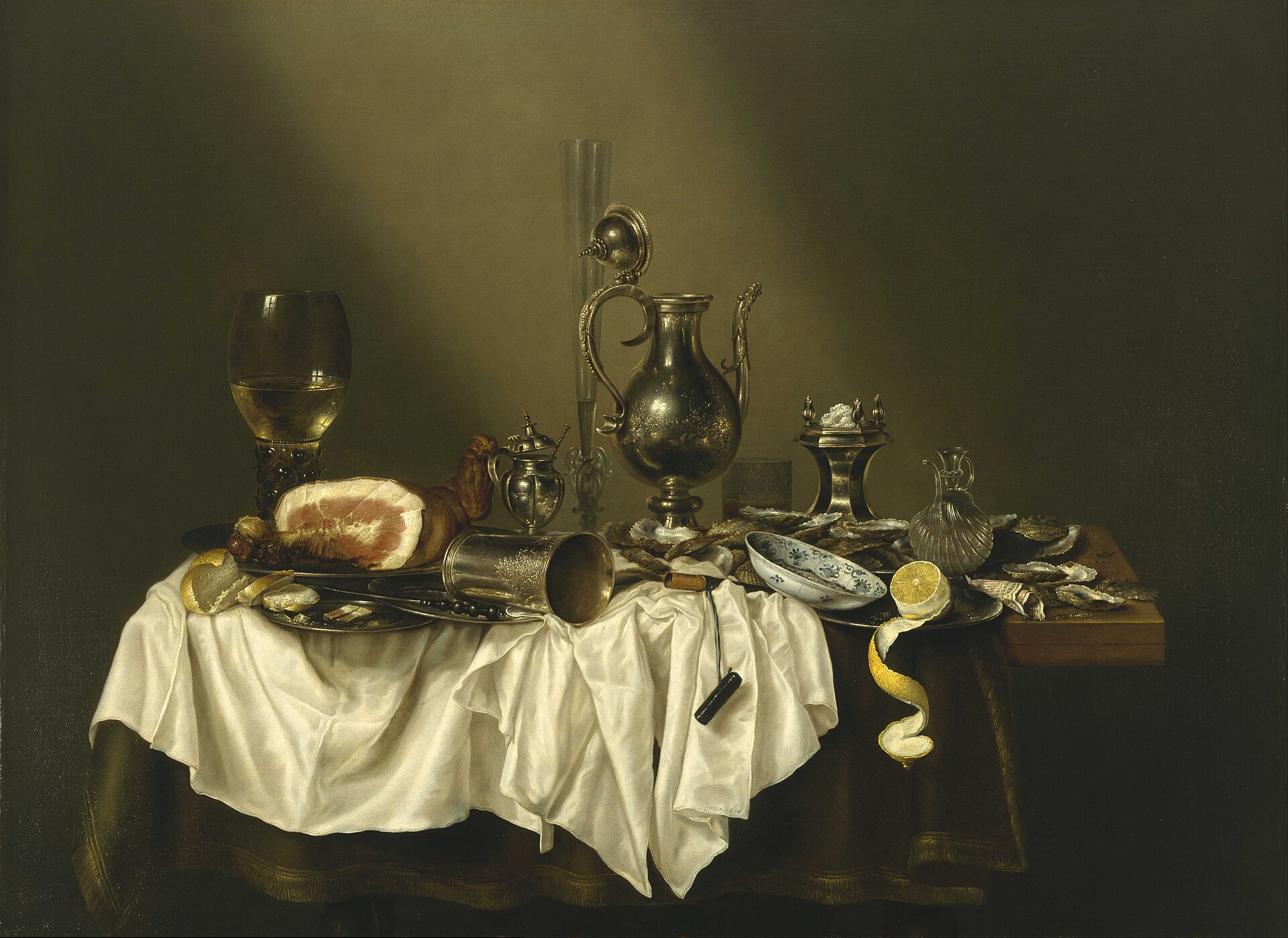

You can argue about authorship, labor, consent, and provenance — and you should — but most generated images lose me before any of that starts. They show up wearing the same waxy skin, the same amber rim light, shallow depth of field, micro-detail no real lens would resolve, and a composition that looks finished because every surface got polished. I see the tool before I see the picture, and right now the tool reads as cheap.
The tells moved#
The old tells were literal: six fingers, melted jewelry, text that collapsed into alphabet soup. Models have mostly fixed those, and the look survived anyway. The tell moved from anatomy to taste.
A large CHI study asked more than 50,000 people to distinguish photographs from images made with Midjourney, Firefly, and Stable Diffusion, and its taxonomy went well past broken hands — shiny or plastic textures, mismatched styles, implausible lighting, photoshoot-like perfection. The researchers picked their synthetic set from thousands of generations to weed out the most obvious failures. Even for a study about spotting fakes, the default output needed an editor.
Any one of those traits can belong in good art. Gloss can be deliberate, physics can be ignored, a face can be strange. What bugs me is the convergence: unrelated prompts keep coming back with the same surface treatment, until the style stops being anyone's choice.
A style chosen by nobody belongs to the machine.
Average taste makes average images#
Image generators are increasingly measured and tuned through human preference. Pick-a-Pic collected real users' pairwise choices and used them to train PickScore, a reward model that can rank generations. Stable Diffusion 3 reports progress through prompt understanding, typography, and human preference ratings. Reasonable engineering targets, as far as they go — but nobody would mistake them for a theory of art.
Optimizing for preference pushes hard toward whatever wins the immediate comparison: a centered subject, cinematic lighting, dense detail, no unresolved edge anywhere. A 2026 paper on personalized image evaluation says it plainly — current reward models optimize for average human appeal while missing individual taste. Average appeal is fine for a product demo. The trouble starts when it becomes the default answer to every visual question.
Art often needs the crop that feels wrong for a second, the dead space, the dirty color, the hand-drawn wobble, the detail withheld. A lot of the job is knowing which attractive feature to turn down, and those decisions can lose a blind comparison and still improve the whole work.
The model can hit every word of the prompt and still have no idea why the image exists.
Quality needs an editor#
What would help isn't another jump in resolution. The good generated images I've seen already involve reference gathering, repeated rejection, masks, compositing, paint-over, typography, and a person willing to strip out the model's favorite habits. The generator supplies material; someone still has to turn the sheen down by hand.
| Default generation | Edited generation | |
|---|---|---|
| Selection | The first image that satisfies the prompt | Repeated rejection against references and purpose |
| Composition | Centered subject and immediate visual hierarchy | Crop, dead space, and emphasis chosen for this image |
| Surface | Gloss, rim light, dense micro-detail | Masks, compositing, paint-over, restrained texture |
| Stopping point | Every edge resolved and every region polished | The image stops when the remaining tension belongs there |
A recent study comparing visual creativity found human artists rated highest, while greater human guidance improved generated work substantially. I don't read that as a mystical boundary around human creativity — more that direction matters, and that a prompt is too small a container for all the decisions an image needs.
AI imagery gets accepted when it stops asking the viewer to discount it on sight. The tool doesn't have to become invisible, but the image has to arrive before the production method does. That takes models that hand artists enough control to make choices the reward model would never make on its own.